Parkinson’s Disease (PD) Exercise App

“To me, hope is informed optimism.”

Michael J. Fox

Opportunity

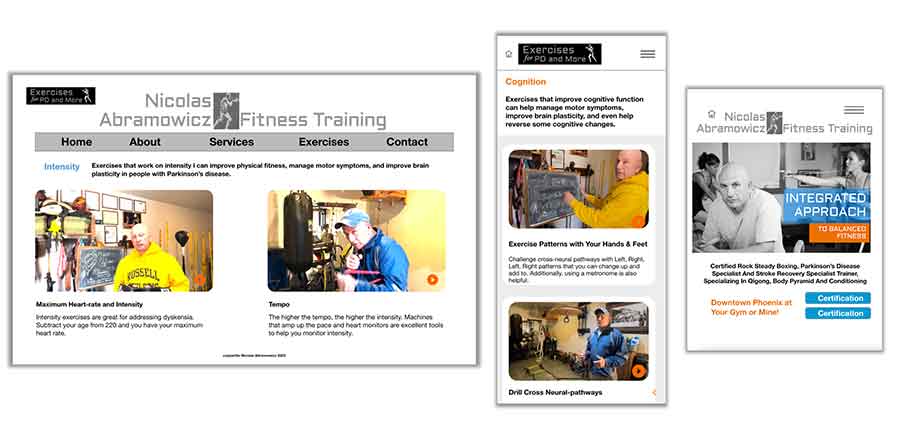
For this project, I had the pleasure of working with a gifted trainer and coach, as well as delightfully optimistic human being, Nicolas Abramowicz. See his website I also designed at https://nicolasabramowicz.com

Role: Lead UX Researcher & Designer
Target Audience: PD patients normally over 50 years of age
Goal: Simple Exercise App for PD

PD App Multiple Devices
PD App laptop, iphone, ipad

Challenge

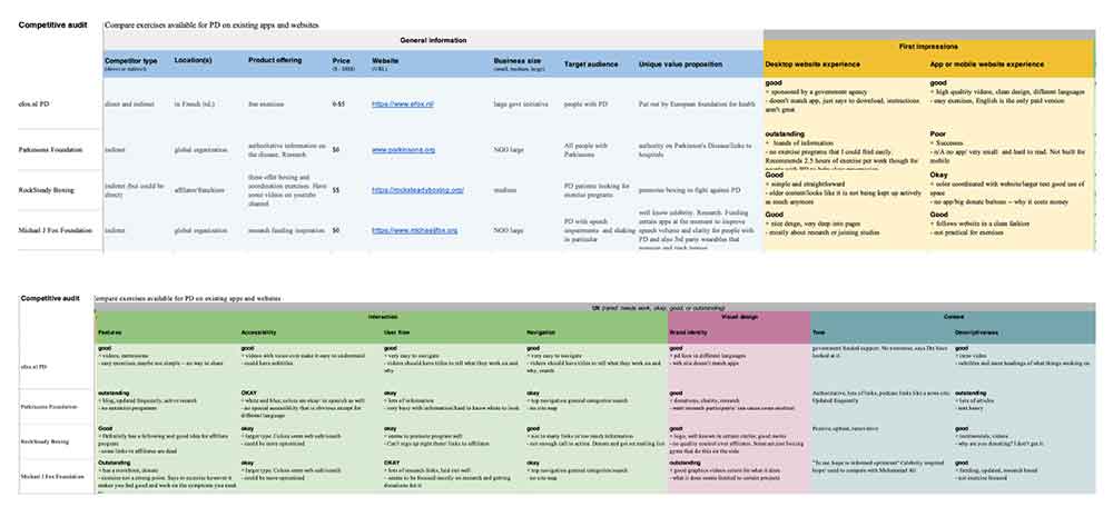
Parkinson’s Disease (PD) is a neurodegenerative disease for which there is no present cure. It is widely believed the exercise is a powerful way to slow progression. Other than figuring out what type of exercises real people with PD need and desire, we wanted to create just a simple app with videos of exercises. Although one exists in the App store developed by a European Foundation for Health and Exercise, the exercises are very targeted probably for people with severe progression. Therefore, the competitive audit showed a need for such an app.

PD Competitive Audit Spreadsheet

Process

The process started with a survey for real people with PD to understand more about their symptoms and exercise routines and needs. Affinity diagrams, user journeys and personas were created from there.

Research and Design Iterations

The research was a very interesting part of this project because I was able to interview only people with PD, and only people over 50, which helped me understand more about the disease and exercises that help with different motor skills. In the research we wanted to know if it’s enough to have mostly videos of exercises or if other features are desired. A search feature would help at scale to find out what people are looking for as they search.

We conducted three rounds of research to date on the app and web pages.

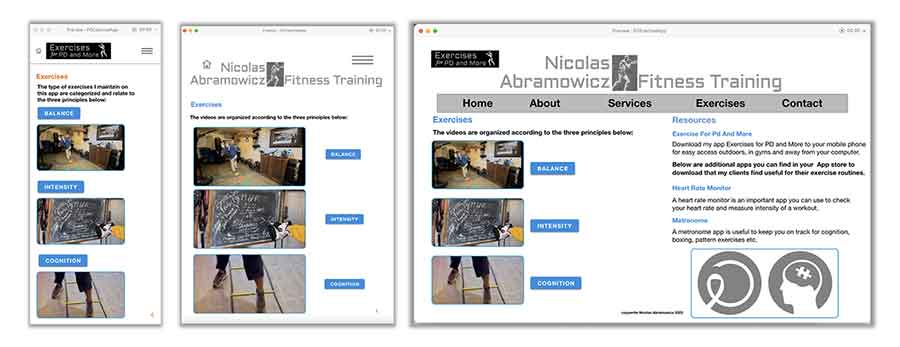
Round 1: Because most of the users are older (over 50), we surveyed their preferred device and what kind of exercises they felt were most useful in addressing various cognitive and motor areas that the disease affects. One thing we learned here was to separate the exercise into three different categories.

Like the My Petz Vet App, I designed the logo for this app as well as the layout.

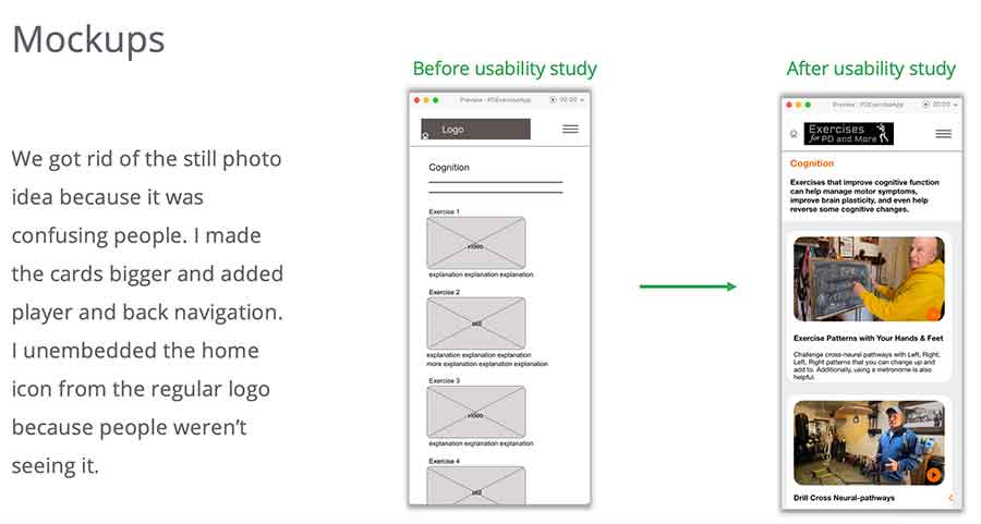
Round 2: Low-fidelity prototypes were tested to gauge the navigation and other feedback of the app, which resulted in a redesign that featured larger videos, a back button and clear play buttons.

PD App Mockups
PD App Mockups Before and After Initial Usability Study

Round 3: High-fidelity prototypes were tested to check multi-device cohesion on the design. This resulted in a further plan for expansion to put some of the videos as extra content and higher quality on a You-Tube channel which makes the exercises and app more discoverable.

PDAppResponsiveDesigns
PD App Responsive Designs

Feedback and Insights

Study participants really loved the exercises and say they would use them immediately. The content is a huge hit and I tried to make the design as simple to keep the focus on what shines on its own and can really help people.

I really practiced the old adage, “less is more” in this project and I think it works well.

Next Steps

  • I would add more videos and higher quality videos if possible to increase content. The instructor has a lot of material but only six original videos were shot for this prototype.
  • I would make a page of stills because some people don’t have the patience for all videos. However, that was the purpose of this app. I would test this out again with study participants.
  • I would like to include close-captioning on the videos because it makes it even more accessible and is preferred for some people to follow.

Veterinarian Office Sign Up Flow

 Desktop and Mobile Screen Sizes plus Logo MyPetzVet

The Challenge

The goal of this project was to determine the interest and usability of the pet registration portion of the veterinarian web site with an older demographic (people over 50) to determine if they are successfully able to navigate pet registration and onboarding. I conducted a competitive audit, user interviews and usability studies and analysis.

I created paper wireframes, low and high fidelity prototypes, iterated on responsive web design and accounted for usability settings important to older users. I also designed the logo.

Role: Lead UX Researcher & Designer
Target Audience: Older demographic who don’t normally use apps

Crazy 8s for Vet Registration Flow

Process

n the beginning of the design phase I took about a minute each to design some crazy-eight wireframe ideas for what screens to have on pet registration flow that would show users the benefits of registering their pets.

The idea was, while a back-end database pulls up the pet records, a carousel goes through these advantages buying time for the dashboard screen build.

It was also important to figure out how a pet registration flow would fit into the overall web site architecture before design began.

Site Map
Site Map

Research

I conducted user interviews which turned into affinity diagram to better understand users and trends.  Most of my user group over fifty had never registered a pet on a veterinarian’s website and were uncomfortable and frustrated with technology. A majority also mentioned needing readers and felt the buttons, especially on cell phones, were too small to navigate. This led to framing the task of pet registration to increase accessibility and simplicity for older users, which will result in improved design for all users.

Affinity Diagram
Affinity Diagram

Meet Sarah

Persona Sarah
Persona Sarah

Design Iterations

 Some unexpected issues appeared with surveying older users.

  1. Unsure of Technology conventions: Older users don’t recognize common clues for web navigation such as a hamburger menu or the fact that a company icon link also takes you home.
  2. Small buttons: Many users complained about buttons being small, especially on mobile. This is one of the aspects of mobile navigation they dislike the most.
  3. Benefit framed as a “Why” Question Needed to be Changed: Men in particular, felt that asking why they should do something when they have already determined to do it, was confusing.
Reframing the Benefits Question
Before and After Usability Study Mockups
Mobile MockUps

Accessibility Considerations

 For Accessibility we:

  1. Kept button deliberately as big on the mobile as on the laptop, because older users wanted bigger buttons. We also tried to create a lot of space between buttons.
  2. Added a voice command feature to the dashboard where users can use voice to change to a different pet, instead of clicking on their pet’s name.
  3. Used web accessible colors with lots of open space on the registration  flow to make the design as simple and straightforward as possible.

What I learned

 In researching vet office pet registration models I was unable to find a vet office that seemed to do their own site in house. It’s outsourced or done by larger holding companies who own the vet offices. The negative feelings towards an impersonal conglomerate make creating a more customized registration offering crucial, especially with older pet owners who are initially reluctant to sign up.

Impact

Our high-fidelity mockup performed remarkably better with older users, once their concerns about navigation, benefits of the call to action and customization of content were realized. All expressed an interest in being able to register their pet in this way.

Next Steps

  • Further usability studies with other portions of the web site.
  • Account settings could also benefit from customization, such as adding an additional point of contact/caretaker to the pet, and also different forms of payment.
  • As technology allows, I would love to add more ability to use voice command over buttons in cellphone navigation in particular.

Single Artist Bio App

This is an app for a prolific artist who currently communicates to many repeat clients through a newsletter but would like to engage more with his fans’ desire for more information about his work. See my one of my favorite contemporary artist’s website at: https://www.edsandovalgallery.com/

Role: Lead UX Researcher & Designer
Target Audience: People who have an interest in art
Goal: An app to categorize and generate interest and ultimately sales in an artists work

Artist Bio App Home

The Process

As lead UX researcher and designer on this project, I conducted a competitive audit, user research, wire-framing, prototyping, usability studies and accessibility testing.

A competitive audit showed most single artists don’t have an app and it is clearly a place to expand.

The Research

After developing personas and user journeys during the ideation phase, we conducted two moderated usability studies with five participants each using low-fidelity and high-fidelity prototypes. Participants were chosen to represent different genders, ages, and accessibility questions and screened with qualifying questions that confirmed they had at least some interest in art. Questions were both quantitative and qualitative and a system usability scale was conducted.

One theme we noticed in the research was that some users were hesitant to use QR codes for download, which brought us to the insight that we should employ an incentive for using one.

Round 1 usability findings also showed that users wanted more features other than the art itself and multiple ways of finding the same thing.

In Round 2 usability testing we found users wanted a more obvious way of exiting a pre-purchase state, better scrolling with the map, and even more info about the artist.

ABA_QRCodeResearch
QR Code Research

Design Iterations

Paper Wireframes and Low-Fi Screen
Hi-Fi Prototype
Hi-Fi Prototype

It was a joy to take color inspiration from the artist’s work to create a color palette I love.

Results and Next Steps

With this app we wanted to let users learn more about the art and artist which would affect their connection to him and his art, hopefully making them feel more engaged and comfortable with their investment and purchases. I knew we had made some impact when users at the end of the second usability study wanted to “look at all the pictures.”

What I learned:

Knowing more about an artist and their work helps patrons feel more engaged and confident in their desire to purchase a piece of art. We can measure the effectiveness of the App by tracking App-related sales as a percentage of overall sales.

In the next iterations I would recommend:

  • All artwork for sale needs to be catalogued into its own page for viewer experience and information. A database should be created for this information that is searchable inside the app.
  • Users want even more information about the artist such as his age, artistic credentials, influences. All of this information should be gathered and flushed out in subsequent screens of the app.
  • An artist newsletter link, calendar of events and FAQ page should be created to create more opportunities for the patrons to get to know the art and artist more completely.
Artist Bio App Large Gif Animation