
The Challenge
The goal of this project was to determine the interest and usability of the pet registration portion of the veterinarian web site with an older demographic (people over 50) to determine if they are successfully able to navigate pet registration and onboarding. I conducted a competitive audit, user interviews and usability studies and analysis.
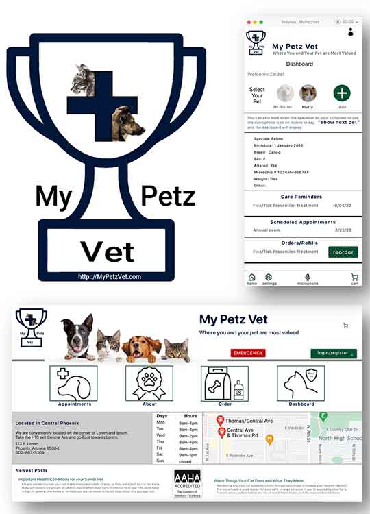
I created paper wireframes, low and high fidelity prototypes, iterated on responsive web design and accounted for usability settings important to older users. I also designed the logo.
Role: Lead UX Researcher & Designer
Target Audience: Older demographic who don’t normally use apps

Process
n the beginning of the design phase I took about a minute each to design some crazy-eight wireframe ideas for what screens to have on pet registration flow that would show users the benefits of registering their pets.
The idea was, while a back-end database pulls up the pet records, a carousel goes through these advantages buying time for the dashboard screen build.
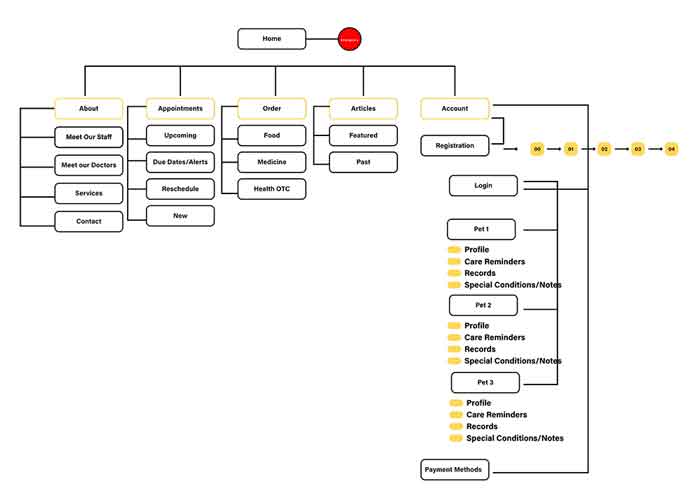
It was also important to figure out how a pet registration flow would fit into the overall web site architecture before design began.
Research
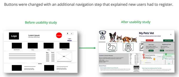
I conducted user interviews which turned into affinity diagram to better understand users and trends. Most of my user group over fifty had never registered a pet on a veterinarian’s website and were uncomfortable and frustrated with technology. A majority also mentioned needing readers and felt the buttons, especially on cell phones, were too small to navigate. This led to framing the task of pet registration to increase accessibility and simplicity for older users, which will result in improved design for all users.

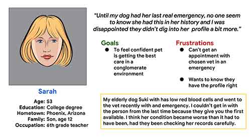
Meet Sarah
Design Iterations
Some unexpected issues appeared with surveying older users.
- Unsure of Technology conventions: Older users don’t recognize common clues for web navigation such as a hamburger menu or the fact that a company icon link also takes you home.
- Small buttons: Many users complained about buttons being small, especially on mobile. This is one of the aspects of mobile navigation they dislike the most.
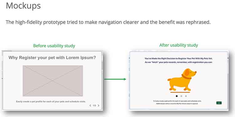
- Benefit framed as a “Why” Question Needed to be Changed: Men in particular, felt that asking why they should do something when they have already determined to do it, was confusing.
Accessibility Considerations
For Accessibility we:
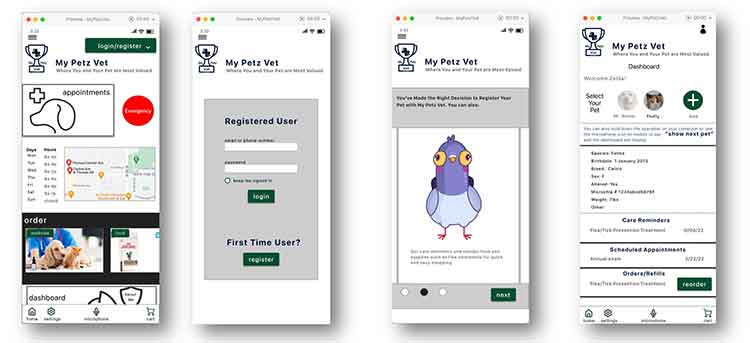
- Kept button deliberately as big on the mobile as on the laptop, because older users wanted bigger buttons. We also tried to create a lot of space between buttons.
- Added a voice command feature to the dashboard where users can use voice to change to a different pet, instead of clicking on their pet’s name.
- Used web accessible colors with lots of open space on the registration flow to make the design as simple and straightforward as possible.
What I learned
In researching vet office pet registration models I was unable to find a vet office that seemed to do their own site in house. It’s outsourced or done by larger holding companies who own the vet offices. The negative feelings towards an impersonal conglomerate make creating a more customized registration offering crucial, especially with older pet owners who are initially reluctant to sign up.
Impact
Our high-fidelity mockup performed remarkably better with older users, once their concerns about navigation, benefits of the call to action and customization of content were realized. All expressed an interest in being able to register their pet in this way.
Next Steps
- Further usability studies with other portions of the web site.
- Account settings could also benefit from customization, such as adding an additional point of contact/caretaker to the pet, and also different forms of payment.
- As technology allows, I would love to add more ability to use voice command over buttons in cellphone navigation in particular.